Which one will you choose?
Grab your compass and start
your Emma Troy Design adventure.
Two roads diverged in a secret wood...
LOGO DESIGN
WEB DESIGN
I’m a brand stylist, web designer, artist and visual storyteller but most importantly, I’m your resident guide on the journey to cultivating a meaningful, lasting and powerful connection with your tribe.
From my farm in mid-north Queensland, I help creative businesses just like yours build brands, websites and visuals that illustrate their story and illuminate their value.
Hi, I'm Emma
The Brand Muse Quiz
take the quiz
Discover your brand muse and learn how to channel her creative force into your business. It only takes 30 seconds!
Learn the secrets to mastering an influential and impactful homepage for your website
The High-Converting Homepage Blueprint
snag blueprint
February 17, 2022
How to Turn Your Boring Website into a Beautiful Online Home
(Even if You’re Not a Pro Designer)

Maths. Mud pies. Muggles. There are lots of things in the world that are boring. Let’s be certain on this, daring DIYer: your website won’t be one of them!
Snatch this secret stash of pro designer tricks to turn your boring website into a beautiful online home. Here’s exactly how to make your website look professional and spellbind scrollers – illustrating your story and illuminating your value all the while.

Let’s get realer than my fiery hair colour for a sec.
(Okay, wow, Emma – that’s real.)
For your website to succeed in 2022, you know it can’t feel like a ramshackle hotel. A place where scrollers consider a short stay, but have no real motivation to check in for long (or return). There’s no place for dirty footprints on the mat. Or a so-so welcome (that features a bashful ‘excuse the mess!’). Your rooms (read: pages) can’t be strewn with dusty rugs, forgotten socks and rogue bobby pins. Or a flashing neon sign out front, too long overdue for a lightbulb change.
No. In 2022, your website has to be a beautiful online home.
Heck, a palace. Or a castle! A majestic place with intricate stairways and secret (not so secret) doors. A welcoming entrance, and paths leading through lush gardens all the way to you and your services. Right there. Behind squeaky clean windows, with the rooms decorated to feel just like you.
A masterpiece to marvel at!

Discover Exactly How to Design A More Professional Website

Inviting potential customers and clients into a homely, yet professional website is to create a bigger impact. And last time I checked, you’re not the type of vibrant creative, coach, or entrepreneur who spends all day slouching in the corner, cradling a packet of popcorn, spying on competitors.
No, you’re ready to stand out so fiercely that no one else could ever come close. To create an online home, palace, or castle that truly reflects you, the way you approach your work and run your business. You’re ready to be (online) house-proud, and feel the same way about your website as you do about what you create for your customers and clients.
That’s why this isn’t your first ring around the research.
So you already know that to make your website professional, mobile optimisation matters (tick). And high-quality imagery, too (double tick). You might’ve even heard that 75% of consumers judge a business’ credibility based on their website design.
But what else can you do in a matter of moments to create a huge impression on your website visitor (even if you’re not a web designer)?
It’s time to finally learn those pro designer tweaks that will take your website from fixer-upper to full-blown breathtaking mansion.
Ready to turn your boring website into a beautiful online home? Grab your paint bucket, a couple of brushes and meet me at the front gate.

Sharing a professional website has never been more important

First impressions are like final genie wishes. You only get one. And since visitors make a snap judgement in 50 milliseconds, yours has got to count.
Forget the ‘it’s what’s inside that counts’ adage for a moment. Why? Because your reader’s craving a big ol’ bowl of experience (yum!). In fact, 88% of online consumers are less likely to knock on your website’s door again after a bad one.
And in case you’re thinking ‘no worries Emma, you adventure-lovin’ country lass – word of mouth is all I need!’ Know that 57% of internet users (read: pretty much everyone) report that they won’t recommend a business with a website that’s not optimsed for mobile. And 47% of people won’t buy from a poorly designed website, full stop.
Rub that genie lamp one last time, would you? *VOILA!* Architecture of what makes a good website irresistibly great really do exist!

What makes a website look (spellbindingly) professional?

You already know what looks professional.
What’s all interior design, Pinterest-save-worthy and pretty to your eyes.
And you’ve also seen things that are more slimy, green and overgrown with weeds when it comes to web design.
I’ll let you in on a secret: you don’t need a fancy degree, sixth sense or even magic beans* to know that.
But it might surprise you that having wickedly good looks isn’t just some random act of (waves wand) alaca-chance!
*Magic beans may help.
A professional-looking website is *actually* a clever construction that mixes:
- Design skills (beauty)
- Psychology (brains)
- User experience (magic dust)
You see, if there’s one thing my years of design study* has taught me, it’s that you don’t need a sparkly scroll to design things well (boy, was that an exxy discovery!).
* Diploma in Marketing & Media, Diploma in Graphic Design, Certificate in Website Design

And after designing custom websites for close to a decade and assisting more than 270 daring DIYers to bring their spellbinding websites to life… I know this to be true: you really can have a professional website (even if you’re not a pro designer). All you have to do is…

1. Use White Space Wisely
On your quest to bat away boring, you may be tempted to fill every last inch of your website with *things*. Think: Aunt Mabel’s musty cottage with porcelain chickens all over the walls. Hey, they’re cute – but there are just too many, and they’re everywhere! I mean, there’s no place to even rest your teacup. C’mon, Aunt Mabel!
Whether it’s with witty one-liners, irresistible imagery or questions in quote blocks… When you want to make your website look professional, beautiful and scroll-worthy – too much is… well, too much.
Why? Because white space (AKA the blank gaps between text blocks and imagery) is like an egg from a magic goose – golden. Psst – ‘white space’ doesn’t necessarily have to be ‘white’. Consider it the corridors between content, so everything’s not stacked on top of its space (so there’s no need to worry about overhearing suspicious ‘buck bucks’ through the walls at night).
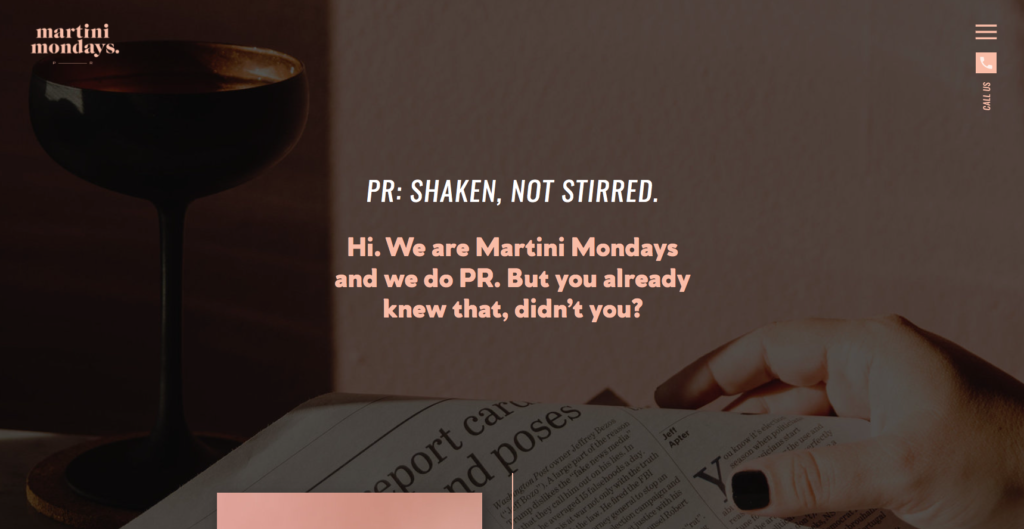
Why should you consider using negative space throughout your online home? According to the Interaction Design Foundation, white space communicates elegance and a quality user experience. And since attention spans are not shrinking – rather getting more selective – top-notch aesthetics rule supreme.
In fact, studies by the clever folk at Wichita State University as reported by Attention Insight show that white space can improve readability and focus on calls to action (CTA), which in turn improves conversion rates.
Use your white space to:
- Give the eyes a break after chunky text blocks
- Allow a message to sink in
- Engage the reader
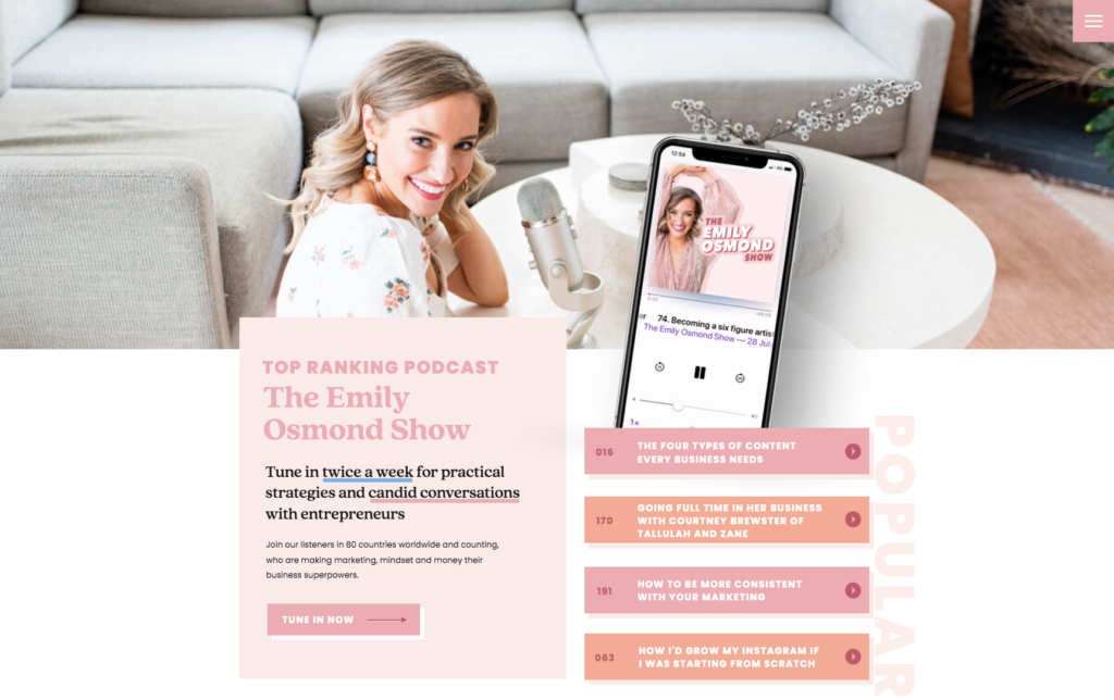
Tip from the Design Studio: micro white space (between text lines) can be increased, decreased or made more interesting with ‘passive’ and ‘active’ white space (like in the example below). Macro white space is the space on either side of the web page, and the space *between* text and imagery. Create greater space to evoke feelings of calm.

2. Calm Down with the Colours
If you’re a fan of fables, tales and leprechauns like me, you too might have a love for rainbows. But, take it from a pro designer: for a professional website look? A concise colour palette is your ultimate sidekick.
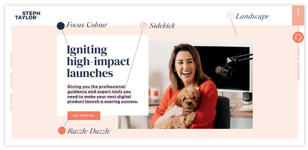
To avoid a colour clashing catastrophe (like lemon striped cushion covers, paisley maroon walls and an emerald polka dot painting – yikes!) here’s a good rule of thumb. Stick to 3 – 4 colours.
Your pro website colours can be broken down into:
- Focus – your core, standout colour
- Sidekick – for highlighting complementary information
- Landscape – a muted background shade
- Razzle dazzle – a contrasting colour to captivate attention
Use colour to:
- Make important information stand out
- Accentuate your CTA
- Influence emotion
- Guide the eye

3. Keep Spacing Consistent
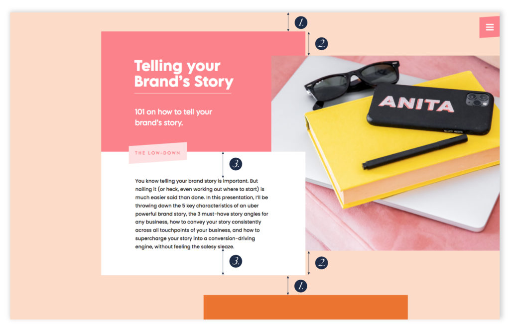
Little gap here, big gap there – not a big deal, right? Not so fast! When you want to make your website look more professional, every detail matters.
Imagine a gallery wall in your lounge room with a single picture in the top left ceiling corner and eight more scattered willy-nilly around the room. Does it hurt your head too?!
You see, consistency helps the reader continue their flow of thoughts. Less thinking? More scanning. Meaning your website user can zip through your site quickly, and find what they’re after as soon as possible.
Check to see if there’s consistent spacing between:
- Content blocks
- Headings to text
- Text to buttons
- Image edges and surrounding text

4. Make Text Scannable
Boy, can it be tempting to gather your reader up, plop ‘em by your website’s metaphorical campfire, and welcome them in for a long yarn. But what if they’re after a specific piece of information? What if they’re in a hurry? What if they’re scrolling your website for precisely three sips of their cuppa left before they hit the ‘x’?
For a beautiful, professional website (that’s also fantastically functional), let them quickly and easily see the important stuff. Plus, guide their navigation based off their current frame of mind.
For example, you’d show a new guest at your place to the bathroom, and someone who’s visited before to the snack cupboard. Much like a new reader may want to read your about page, then once they’re familiar with you, they’re ready for services.
Succinct information matters. In fact, one study by Nielsen Norman Group showed that 79% of participants scan website pages, with just 16% reading everything word for word. And Forbes rate scannable content as the most overlooked factor of content marketing.
Here are some tips to make text easy to scan:
- Use headers
- Bullet point lists
- Bold, highlight or underline core words

5. Keep Your Eye on Conversion
It can be tempting to beautify your website until the cows come home. So firstly, welcome in those cows (if they politely wipe their hooves on the mat!). Then (once they’re all tucked in), check your website has both beauty and brains.
Because the truth is, even if your website is a beautiful online home with perfectly-placed pictures, scientifically-spaced site text and correctly-coloured call to action buttons… None of that matters if it isn’t optimised for conversions.

Introducing Beautiful Showit Website Templates for Creatives and Coaches
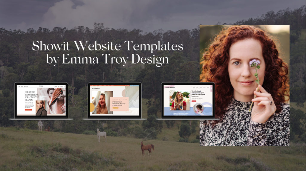
Good news, daring DIYer: you don’t have to navigate the bamboozling world of how to make your website look professional alone.
In fact, I’ve taken all the tricky professional-looking website rules and applied them to my Showit Website Templates. And all you need to do?
- Input your images
- Paste in your text
- Update to your colours
Confidently know your entire layout has the perfect balance of white space, and carefully curated colours to guide you. They’re even optimised for conversion. Finally, share your professional website with the world, without having to do any of the fiddly design stuff (like pruning text blocks, composing a floor plan or hanging hooks for imagery).

Here’s your foolproof way to share a beautiful, professional website and online home with the world. One that’ll have guests begging to stay for ‘just one more night – please!’
Go on! Browse the templates.

shop website templates
Adventure arm-in-arm with your loyal guide (AKA me) and follow your hero path towards victory. Your brand’s new castle awaits.
I like your style!
dare to venture into DIY land?
Welcome to my online home, explorer! I'm the chief popcorn muncher, head chocolate connoisseur, resident artist, passionate visual storyteller and your creative bestie.