Which one will you choose?
Grab your compass and start
your Emma Troy Design adventure.
Two roads diverged in a secret wood...
LOGO DESIGN
WEB DESIGN
I’m a brand stylist, web designer, artist and visual storyteller but most importantly, I’m your resident guide on the journey to cultivating a meaningful, lasting and powerful connection with your tribe.
From my farm in mid-north Queensland, I help creative businesses just like yours build brands, websites and visuals that illustrate their story and illuminate their value.
Hi, I'm Emma
The Brand Muse Quiz
take the quiz
Discover your brand muse and learn how to channel her creative force into your business. It only takes 30 seconds!
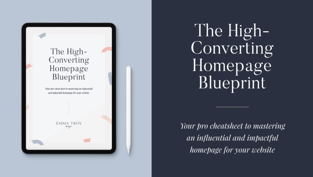
Learn the secrets to mastering an influential and impactful homepage for your website
The High-Converting Homepage Blueprint
snag blueprint
October 28, 2019
The curse of the horrible website
Seven deadly website design curses murdering your conversions (and how you can save them)

It was a dark and stormy night.
And in a flickering, lightning-streaked room eerily like your own, a solitary laptop lit up the worried face of a creative entrepreneur. On the screen was a website, her website; the very one she’d pinned her hopes and dreams on.
But in a month when nightmares roared awake and roamed the streets, she was being haunted by a curse closer to home: website conversions … or the lack thereof.
So while everyone else was worrying about what Jason was up to, she was refreshing Google analytics and stressing over how to get the results she wanted (and deserved).
Sound familiar?
As a website designer, I’ve dedicated my career – and life – to helping creative female entrepreneurs achieve their dreams by gifting them with a digital presence that captures the heads and hearts of their dream audience.
Because the truth is that the curse of crappy conversions isn’t conjured up out of thin air; it’s a symptom of a far more nefarious bad guy: The horrible website.
And even though creating a website can look and seem easier than ever these days, the reality is that there are thousands of ways you could unintentionally get it wrong (and scare away your dream customers!)
Light up your lanterns and meet me inside while I share just seven of the curses potentially plaguing your creative website.


Seven deadly website design curses murdering your conversions

Curse #1: Uninspiring imagery
Nothing says, “Boo!” quite like an uninspiring website image. Whether it’s fuzzy, blurry, loads slowly or simply has nothing to do with what you’re offering, your website imagery has the potential to send your dream audience fleeing.
The cure: I recommend investing in professional imagery for your website. If you can’t afford custom brand photography, be sure to explore stock photos that are aligned with your brand. If you get stuck, ask your web designer for help.

Curse #2: There’s too much happening
Nobody likes being overly busy. Not in life, and not on a website. Because a busy website – with too much images, too much copy and not enough space to breathe – is more overwhelming than your scary movie cutting out during a blackout. And with overwhelm comes unwillingness to engage – the last thing you want your dream audience feeling!
The cure: Embrace balance with your copy, design and imagery. If your site can’t be easily navigated at a glance, there’s too much going on.

Curse #3: There’s too little happening
I love minimalism, I’m all about minimalism, but in the same way that a site can have too much goin’ on, it’s also very possible for a site to have not enough goin’ on. There’s digital peacefulness on a site that’s both magical and mysterious, and then there’s a webby awkward silence that makes you wonder if there’s actually any substance underneath that style.
The cure: Ensure that your site, at the minimum, clearly articulates (through design, copy and imagery) what you do, how you do it, why your audience should care and what they should do next.

Curse #4: Inconsistency isn’t intriguing
Can’t choose between a set of cute fonts? Stuck on which colour palette best reflects your biz? Why not have both, right? ‘Cept this is one of the times you really shouldn’t do all the things. Trust me, I get it, lovely. I’m a colour connoisseur and a font collector. But your audience needs to trust in your brand, and the way of instilling that trust is by offering a consistent and stable brand experience.
The cure: Define and refine a clear brand style and stick to it, across all platforms and mediums. This includes setting distinct header types for your site, as well as a brand voice, colour palette and image use.

Curse #5: Your load time is lengthy
Your mama might tell you that good things take time, but the truth is that the modern world isn’t going to wait around for you to reveal your brilliance pixel by high-resolution pixel. We’re a fast-moving bunch of humans, and we expect our websites to keep up. Which is likely why research by Akamai revealed that even a two-second delay in website loading time can bump up your bounce rate (how many people click off your site) by more than 100%.
The cure: Choose a professional graphic designer that knows how to make your website look and feel great, without compromising your loading time.

Curse #6: The adventure is MIA
Your website should be more than a static business card. Your mission (should you choose to accept it) is to turn your site into a digital destination that intrigues and entices, effortlessly persuading your dream audience to come on an adventure with you from stranger to loyal customer.
The cure: Create a user experience that clearly guides your audience to your key emotional touch-points and information. If you’re not a user experience pro, choose a web designer with the experience and expertise to create a digital adventure your audience will love.

Curse #7: Your copy isn’t compelling
Remember: Style is nothing without substance. And as pretty as your website might be, it needs to be purposeful too. Which is where your words come in! Your copy should be the fluffy cake component of your webby cupcake. The icing is your design, but the words are what your audience will consume and devour. So make them tasty!
The cure: I recommend spending 90% of your energy and effort on your headings and headers. Most visitors are skim-readers, and user experience research has shown that headlines and headers draw the most attention when it comes to copy. Also be sure to use clear but punchy call to actions that drive action.

Psst – Wanna learn the secrets to mastering an influential and impactful homepage for your website? Get the FREE blueprint!

shop website templates
Adventure arm-in-arm with your loyal guide (AKA me) and follow your hero path towards victory. Your brand’s new castle awaits.
I like your style!
dare to venture into DIY land?
Welcome to my online home, explorer! I'm the chief popcorn muncher, head chocolate connoisseur, resident artist, passionate visual storyteller and your creative bestie.