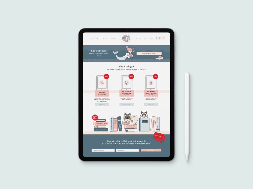
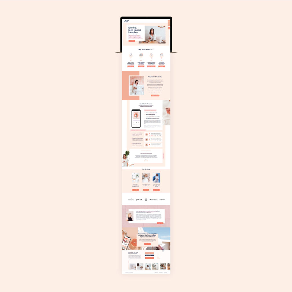
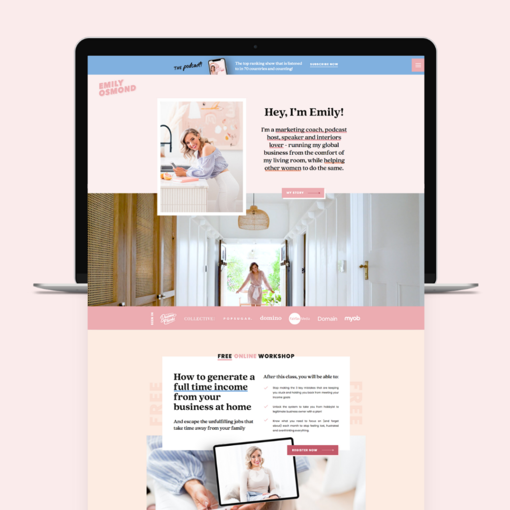
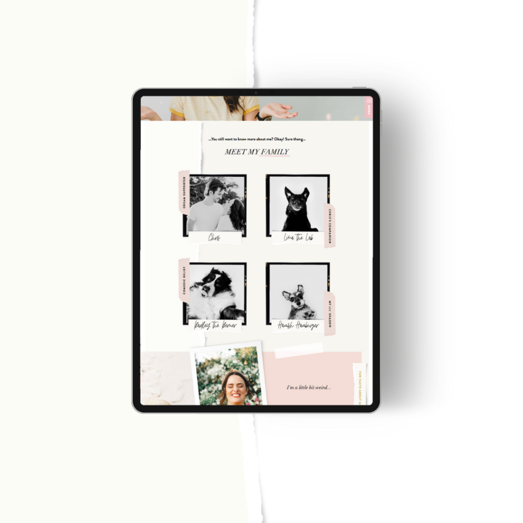
Which one will you choose?
Grab your compass and start
your Emma Troy Design adventure.
Two roads diverged in a secret wood...
LOGO DESIGN
WEB DESIGN
I’m a brand stylist, web designer, artist and visual storyteller but most importantly, I’m your resident guide on the journey to cultivating a meaningful, lasting and powerful connection with your tribe.
From my farm in mid-north Queensland, I help creative businesses just like yours build brands, websites and visuals that illustrate their story and illuminate their value.
Hi, I'm Emma
The Brand Muse Quiz
take the quiz
Discover your brand muse and learn how to channel her creative force into your business. It only takes 30 seconds!
Learn the secrets to mastering an influential and impactful homepage for your website
The High-Converting Homepage Blueprint
snag blueprint
April 1, 2020
Why you need a conversion optimised website
Sally’s* site’s was so pretty it could have landed a modelling contract and become a Victoria’s Secret angel.
… So why didn’t it convert?

The theme Sally had chosen for her website was a visual masterpiece. Gadgets, gizmos and glitter oh my.
And even though it’d taken longer, been WAY harder (and cost her far more time, money and sanity) to build than she’d expected, she was chuffed with the final result.
And there it was: Hanging out there in the Wide Wonderful World, doin’ it’s webby thang and showcasing some serious style.
And there she was: Refreshing her emails, checking if her broadband cable was still connected (it was) and worrying herself silly with conversion conundrums.
Because. Why. Wasn’t. It. Converting.
When the answer – and solution – was simple …
Looks weren’t everything.
But – gulp – Sally had picked a website theme purely for its prettiness – when she should have focused on something else entirely.
Wondering what it is? Keep reading, my clever friend.

Why your site needs to be a superhero (not just a supermodel)

In the Age of Anxiety (yep, I’m calling it), your audience are looking for meaningful solutions to their stresses.
Sure, they might temporarily self-soothe with something pretty. And ‘pretty’ is easy to find. With just a swipe of a finger and a click of a button, you can be enveloped in a world of pretty.
But pretty is pretty disposable. Pretty is pretty shallow. Pretty is pretty superficial.
Pretty might catch their attention – but it won’t capture their heart.
It’s the one before The One.
And if your (and Sally’s) legendary target market are gonna commit, trust me: They’re gonna hold out for the business, website and offering that’s MORE than just pretty … but that has meaningful substance too.
They don’t want a one-click stand – they want a happily ever after with a website that saves the day by giving them #allthefeels (and every reason to convert).
So if being just pretty doesn’t convert … what does?

The truth about conversion optimised websites

As a professional website designer specialising in conversion optimised Showit sites *humbly buffs shirt*, I’m proud to have mastered the art of carefully channelling a duo act of creativity and conversion optimisation into my websites.
And in my opinion (and experience) there are three stand-out qualities that make up a website that converts like wildfire.
They are:
1. Appearance (Yep, pretty does play a part – it’s just not the whole show.)
2. Copywriting (aka the words and content.)
3. User experience (aka the strategy and digital journey you take your website visitor on.)
When those three elements work in harmony, it’s angels singing and conversions ka-ching’ing.

And while Sally had ‘pretty’ downpat, she’d fallen short on the other two conversion qualities.
Not because she was a horrible writer and didn’t empathise with her visitors, but because the template she’d chosen didn’t allow her to effectively showcase her copywriting and user experience.
And because her theme was fairly static (i.e. inflexible), she had to anxiously cram all her business, website and content into the EXACT teeny-tiny space her theme allowed.
She didn’t have the freedom to create a website that met HER needs – let alone gave her any semblance of creative or strategic autonomy.
Instead, she was stuck with a website template that barely had space for an image and paragraph of text on the ‘about’ page (which is nowhere near enough content to connect with her audience), let alone had the flexibility to fit her and her visitor’s unique needs.
She also struggled with:
- Getting her visitors to actually click on the pages she wanted them to visit (because her call to action buttons were hidden in the ‘pretty’ website design).
- Compelling her visitors to read her copywriting (because her ‘pretty’ website design chunked all the text together in unreadable blocks of tiny text.)
- Which meant she couldn’t convert (because her ‘pretty’ website was failing to meet her visitor’s emotional needs).

The Showit conversion optimised site solution

I’ve seen Sally’s story time and time again.
I don’t want you to be Sally.
I want you to be Cass, a creative copywriter who after her new brand and Showit website went live turned creativity into cash and got a 300% return on investment in just 48-hours, started converting 90% of new client contact submissions and doubled the average time a visitor spends on each page of her website.

I want you to be Steph, my launch specialist client who successfully tilted into a new niche, elevated her digital game and brought in $250K+ within 7 months of launching her brand and Showit website.

I want you to be Emily, my marketing coach client whose new brand and Showit website (using my Penelope Template) saw her sell out her high-end mastermind in just 1 day.

I want you to be Erin, my photographer client whose new Showit website saw her book $9500 worth of work within 24 hours of launching.

I want you to succeed – and kick those conversion goals!

Which is why my Showit templates are:
Pretty but also functional.
Pretty but also strategic.
Pretty but also persuasive.
Pretty but also flexible.
Pretty but also customisable.
Pretty but also conversion optimised.
They’ve been designed to walk the runway and lead the boardroom. They’re superheroes and supermodels, allowing you to show-off a website that has beauty and brains … and supports your conversion goals.
So you don’t have to refresh your inbox, check your Broadband connection or chew your nails to the quick.
Instead, you’ll enjoy a Showit website theme experience that allows you to tailor your site to suit your needs – giving you the freedom and the power to master your conversion optimised website with ease.

Are you ready to meet your website success-makers? Sashay over to the shop

*Sally isn’t real. But it’s really possible for one DIY-loving business owner to become Sally if they purchase a theme purely for its prettiness! Don’t be Sally.
shop website templates
Adventure arm-in-arm with your loyal guide (AKA me) and follow your hero path towards victory. Your brand’s new castle awaits.
I like your style!
dare to venture into DIY land?
Welcome to my online home, explorer! I'm the chief popcorn muncher, head chocolate connoisseur, resident artist, passionate visual storyteller and your creative bestie.